Consumer dashboard
Simple answers to two important questions: animal welfare conditions in the barn, and whether environmental indicators look sound.
Filter by season
Data available: Winter 2024 — Summer 2026
Showing all available data
Animal housing — air quality for welfare
One chart per gas — every barn on the same scale
Each column = one barn’s average reading. Barns are ordered worst-to-best. The legend under each chart shows the recommended ranges for each colour band.
Ammonia level (ppm)
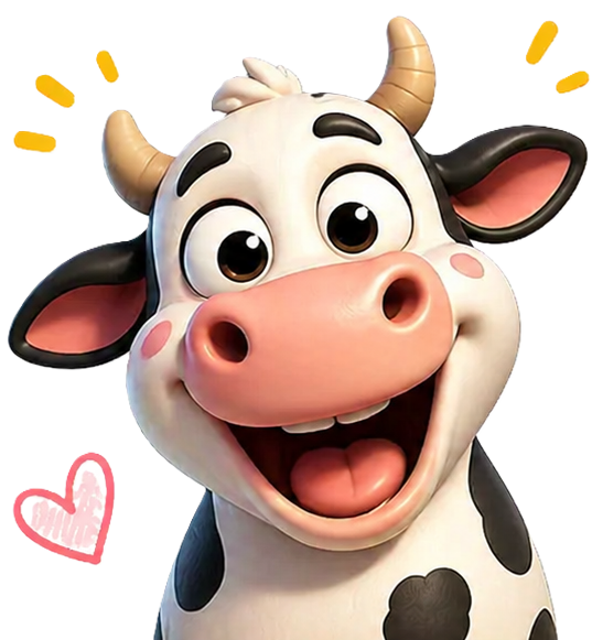
Cows look comfortable
Readings stay in the green zone across available barns.
Optimal
below 7.5 ppm
Borderline
7.5 – 9.5 ppm
Action needed
above 9.5 ppm
CO₂ level (ppm)
Cows look comfortable
Readings stay in the green zone across available barns.
Optimal
below 2,500 ppm
Borderline
2,500 – 2,850 ppm
Action needed
above 2,850 ppm
Environmental impact — climate and air quality
Climate & dust — same dot-plot idea
Each column = one barn’s average reading, sorted worst-to-best. See the legend under each chart for the recommended ranges per colour band.
Dust level (mg/m³)
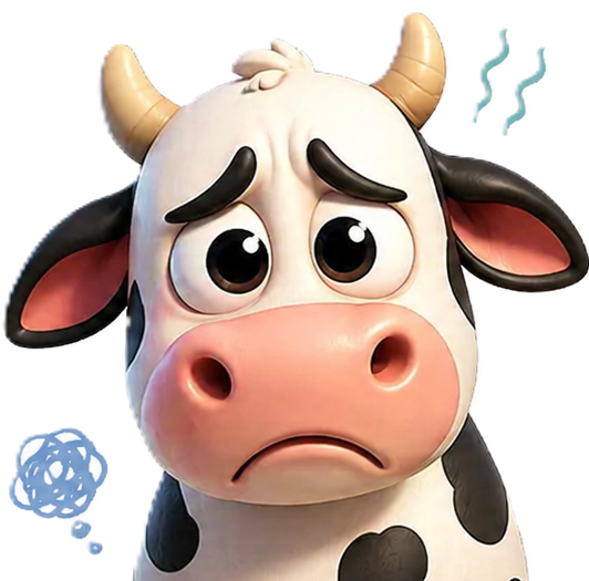
Cows may be uncomfortable
Some barns are in the red zone. Conditions likely need attention.
Optimal
below 0.18 mg/m³
Borderline
0.18 – 0.23 mg/m³
Action needed
above 0.23 mg/m³
Humidity level (%)
Cows may be uncomfortable
Some barns are in the red zone. Conditions likely need attention.
Optimal
30 – 70 %
Borderline
25 – 30 % or 70 – 80 %
Action needed
below 25 % or above 80 %
Temperature level (°C)
Cows may be uncomfortable
Some barns are in the red zone. Conditions likely need attention.
Optimal
5 – 15 °C
Borderline
−5 – 5 °C or 15 – 20 °C
Action needed
below −5 °C or above 20 °C
Need deeper insights?
Create a free stakeholder or farmer account to explore full live data, thresholds and private messaging.